The CSSN website has three incident statistics charts - "Type", "Country", and "Over Time" - that help you explore and understand incident data. Think of them as different ways to "slice and dice" the same information to answer different questions.
1. Incidents By Type Pie Chart
What it shows: A circular pie chart where each colored slice represents a different type of reported incident (e.g. Theft, Robbery, Piracy, etc.)
What you can do:
Change the year using the dropdown menu to see data for a specific year or all years combined
Click any slice to see a detailed list of all incidents of that type below the chart
Best for answering: "What kinds of incidents happen most often in the caribbean region?" or "What were the main types of crimes reported in 2024?"
Example:
You're planning a 2025 Caribbean trip and want to know what types of incidents to be most aware of.
1. Select "2024" from the dropdown to see a full years worth of data (and then 2025 for the most recent data)
2. Look at the pie chart - maybe you see "Theft" is the largest slice
3. Click on the "Theft" slice to see a list of all theft incidents from 2024, including where and when they happened
4. Repeat for 2025
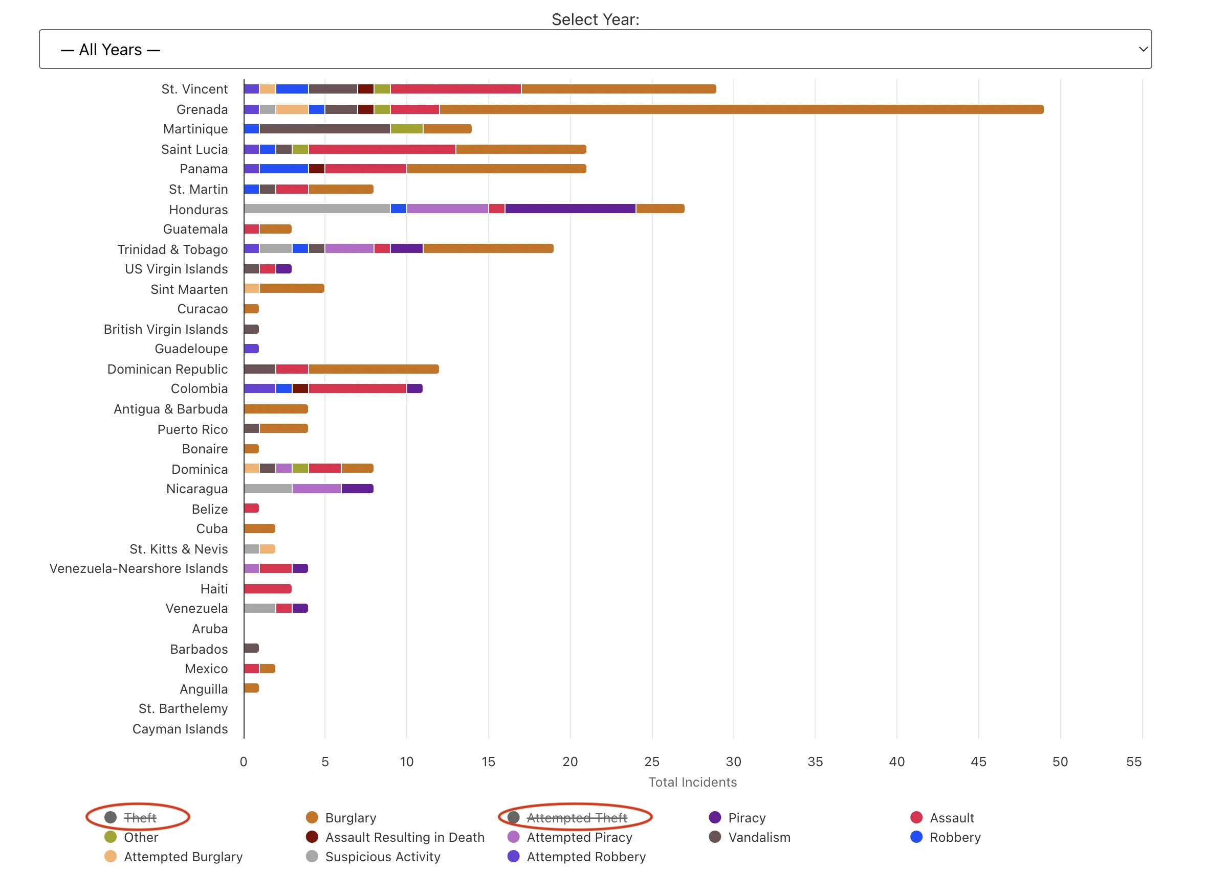
2. Incidents By Country Bar Chart
What it shows: Horizontal bars showing reported incident counts by country, with each bar color-coded by incident type
What you can do:
Filter by year to focus on specific time periods
Click any colored section of a bar to see incidents for that country + incident type combination
Hover over a colored legend incident type at the bottom to see ALL incidents of that type across every country
Click a colored legend incident type at the bottom to remove it from the chart. Click it again to add it back.
Compare countries - longer bars mean more total incidents
Best for answering: "Which countries have the most incidents?" or "What types of incidents happen in a specific country"
Example 1:
You're considering visiting St. Lucia and Martinique, and want to compare their safety profiles.
1. Select "2024" or "2025" to see recent data
2. Look at the horizontal bars - one shows St. Lucia, another shows Martinique
3. Click on the "Theft" section of Martinique's bar to see all 2024 theft incidents that happened there, and notice the location details below
4. Then click on the "Theft" section of St. Lucia's bar to compare
Example 2:
Theft is the most common incident reported. You want to get a clearer picture of other types of crimes in the Caribbean region.
1. Select "2024" or "2025" to see recent data
2. To deselect "Theft" and "Attempted Theft" from the chart, click the colored legend incident type at the bottom
3. Now you can compare other reported incident types across all countries.
Example of clicking legend items to filter incident types in the country chart
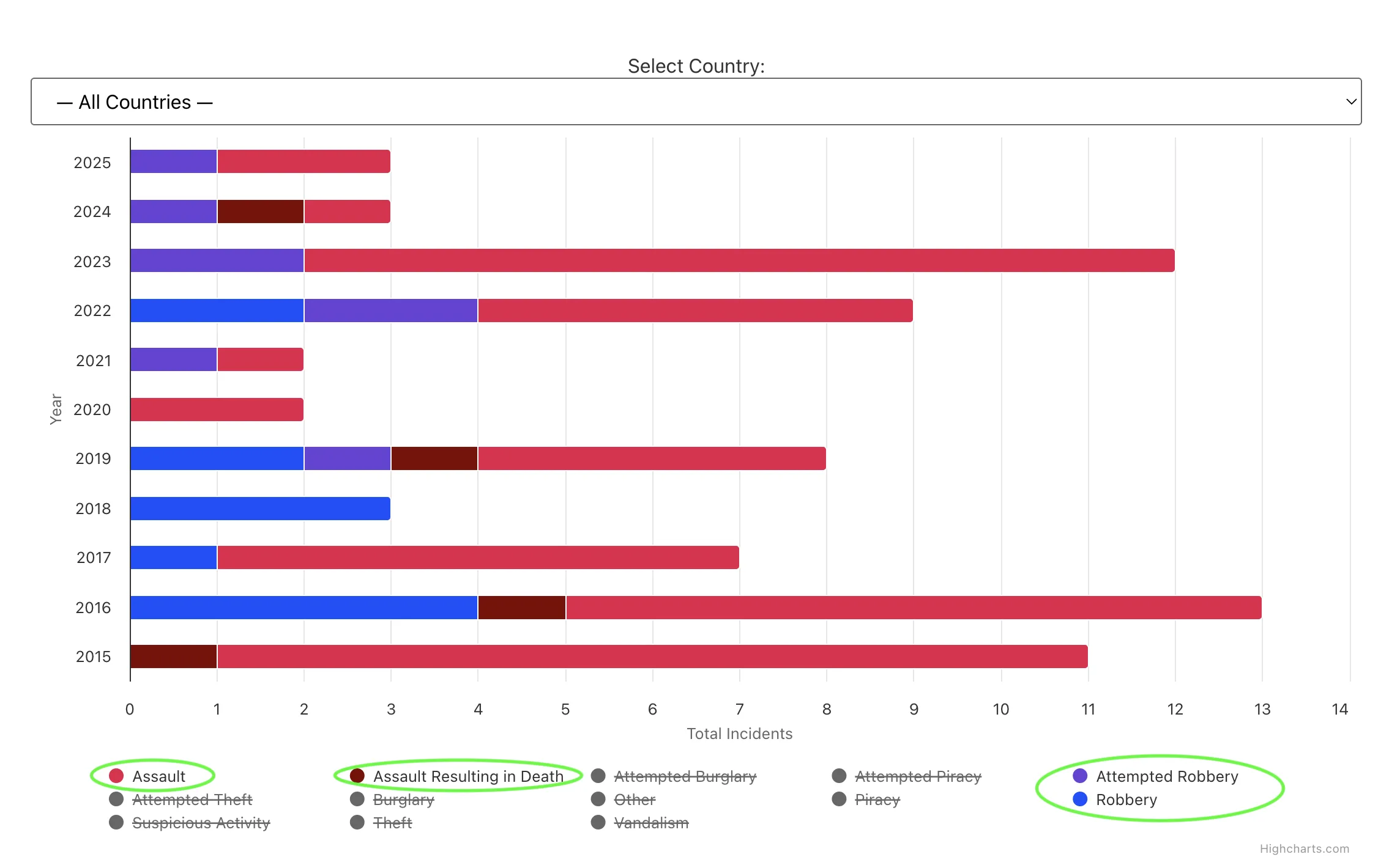
3. Incidents Over Time
What it shows: Year-by-year bars showing how incident numbers change over time, stacked by incident type. This allows for a quick visual overview of trends and patterns.
What you can do:
Select a specific country from the dropdown or view all countries combined
Click any colored section of a year's bar to see incidents for that year + incident type
Spot trends - see if incidents are increasing, decreasing, or staying stable
Best for answering: "Are reported incidents getting worse or better over time, per country?" or "How have the most violent crimes trended since 2020, in a country?"
Example 1:
You heard that violent reports have increased in the region and want to check the data.
1. Select "— All Countries —" to see the big picture
2. Strike out all incident types except "Assault" and "Assault resulting in death"
3. Note any trends
4. Click on any section to see/review the supporting incidents
Example of selecting specific countries to analyze trends over time
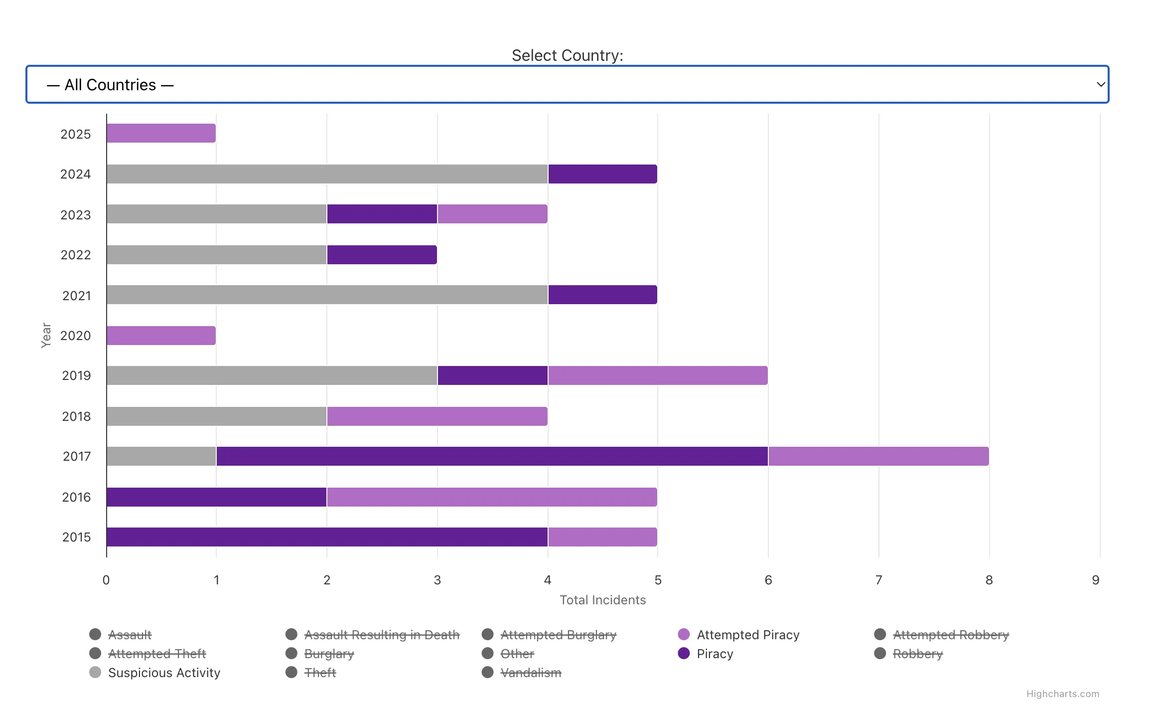
Example 2:
You heard that Piracy reports have increased and want to check the data.
1. Select "— All Countries —" to see the big picture
2. Strike out all incident types except "Piracy", "Attempted Piracy"
3. Note any trends
4. Add "Suspicious activity" to the filters, review trends
5. Click on any section to see/review the supporting incidents
6. Switch to the Dedicated Piracy Map to see the graphical representation of piracy related events and query individual incident details
Example of analyzing piracy trends by filtering incident types over time
The Magic Click Feature
Here's the powerful part: When you click on ANY part of ANY chart (slice, bar section), you'll see a detailed list of actual incidents appear below the chart. This list shows:
Incident ID numbers (click the link to read the full report) and activate the proximity selectors
Dates when incidents occurred
Locations where they happened
Brief summaries of what happened
Small info icons (🅘) you can hover over for a short summary.
Pro Tip: You can use the three types of charts together, to build better context for your research. The "Incidents by Type" gives you a general sense of the region. From there, the "Incident by Country" gives you a sense of the most common incidents in a specific country. Finally, the "Incidents over Time" gives you a sense of the trends in a specific country and allows you to drill down into the details.
Real-World Usage Example
Example 3:
You're planning to spend hurricane season in Grenada beginning in June 2025.
1. Go to the Incidents By Country Chart and select "2024"
2. Find Grenada's bar and hover/click on it to see what types of incidents happened there
3. Go to the Incidents Over Time Chart, select "Grenada" from the dropdown
4. Look at the trend from recent years to see if incidents are increasing or decreasing, note the crime types and location details, click on any bar segment to see the supporting incidents, click any incident number to see a full report and activate the proximity function
5. Go to the Interactive Incident Map, select Grenada, years 2024 and 2025, to see a visual overview of the reported incidents. Click any incident number to activate the proximity feature and deepen your analysis
Event Type Colors
Our charts use the same color scheme as our Interactive Map plugin. Each event type is consistently represented by a specific color:
Event Type
Color
Theft
Green
Burglary
Orange
Attempted Theft
Teal
Piracy
Purple
Assault
Red
Other
Olive
Assault Resulting in Death
Dark Red
Attempted Piracy
Light Purple
Vandalism
Brown
Robbery
Blue
Attempted Burglary
Light Orange
Suspicious Activity
Gray
Attempted Robbery
Blue/Purple
Wherever you see these event types—whether in slices, bars, or detail lists—the color remains consistent to help you quickly identify incident categories.
Tips for Exploring
Start broad (all years, all countries) then narrow down using the filters
Use the different charts to answer different questions about the same data
Click around! The charts are designed for exploration
On mobile devices, the incident details will display in a single column for easier reading
Common Questions
Why don't I see data for certain countries or event types?
Possibly no incidents have been reported (or published) for that selection. Check the filters or the detail panel for "No incidents found."
What if the charts don't load or spin forever?
Try refreshing the page, check your internet connection, or come back later.
Do these charts reflect real-time updates?
Yes, though we do cache the results (for performance). Typically, new incidents appear within a few hours or by the next day, depending on site updates.